Tuesday 27 March 2012

Week 3 Final Design Drawings and Poster Composition

This week I completed that drawings that were assigned to me, and then met with Marnie and Rebecca to finish the diagrams, do the writing and help where we could in putting the posters together.

These are my completed drawings:
Elevation looking from the Story Bridge. Marnie put in the people and the background.

Elevation looking from the river. Again, Marnie put in the people and the background.

The floor plan of the folie showing the section lines.

Isometric 1

Isometric 2
We decided that to start with, my drawings should be just line drawings, and that backgrounds and colour would be added from there. The elevations were put in context against the cliffs, with the shed that is next to them included to show the folie's scale in the site. We also decided to put people in these two images to show how it related to human as well as built scale. We made the decision to leave the floor plan without context, as it was shown more effectively in other views and there was limited space on the panels, and also to leave the isometric views without context so that the built form itself is what is focused on in these images.

Craig completed the sections that show the lighting effects that the walls create, and what the space is like size-wise for those using it. His sections also show how the footings and water work with the building.


Bec completed the detail drawings of the runners that allow the walls to move, and the footings that hold the walls in place. We knew that it was important to use diagrams to explain the folie, especially as ours moved, so Bec and I worked on those together, and also completed the narrative to accompany the drawings.

The layout of the posters had been allocated to Marnie as a job, and she had been considering their composition since the beginning of the project. We had decided that we wanted to keep the layout simple and clean, with muted greys and possibly browns and greens to tie in with the colours on the site. Initially Marnie had wanted to have one long strip of photo montages running through the middle of all three posters so that they came together into one large poster, but in the end it wasn't possible to do that and fit in the rest of the drawings as well. Bec and I worked with her to come up with a new layout that had a row of photo montages at the bottom of the first and half of the second poster, and a row at the top of half of the second and all of the third poster. These rows connected the three posters together, and allowed us space to have our images flow through the space in the middle from our folie in its broadest context to its most specific details so that our design could be easily read. We were extremely happy with the end result; the posters explain our design in the most effective way possible, and we believe that this structure really could give its users a much better understanding of the power of the river that is at the core of the city.

Week 2/3 Design Process

During the workshop on Wednesday I presented my design proposal to the group. We were all fairly happy with it, but after speaking to the tutors, we could see that it didn't really create a space as much as create a sculptural object. We decided to still stay with the same theme, but try and create a more evocative space. I came up with a quick sketch of a structure while on of the tutors was talking to us, which was a cylindrical building with two layers of walls and two different sets of openings. As the outside wall moves with the tide, the beams of light that enter the building change, making the user aware of the water.
A structure with two layers of walls, one of which moves.
We decided that the form was too heavy and clunky for the site, so I came up with the idea of splitting the cylinder into two halves and sliding them away from each other.

From there I worked in a rough axonometrice cube to develop it into a 3D form. The form is made up of two walls that curve around each other to create a space in the middle that 'submerges' the user into the realm of water. There are two layers of walls on each side, with the outside wall moving to create different beams of light entering the space. The floor is made of perforated metal so that the lapping of the water underneath the structure echoes around the interior space.

From the outside, users are fairly unaware of the movement of the outside walls, as both layers are made from the same material. As the user steps inside, they are suddenly surrounded by the effects of the movement of the water. They can spend a minute or ten in there, and as they emerge into the outside world again, where the water is not so obvious, it will hopefully magnify the hidden strength of the river.

We agreed on this form as our folie design, and divided the drawings from there. I was allocated the task of doing the elevations, floor plan and isometric views of the building, as well as the task of doing the writing. We are planning on getting together again on Tuesday morning, the day before the assignment is due, to do the finishing touches, and support Marnie as she puts the posters together.

Week 2 Design Process

I took my initial design to the group meeting this week, and although the group liked the ideas and concepts that I had come up with for it, none of us were all that happy with the actual form that I had come up with. I decided to start from scratch, and started by doing an abstraction of the curves and grids of the city to create different shapes.
An abstraction of the curves and grids of the site
From there I developed those shapes into three different panels that moved with the tide.
The three panels move so that at low tide, there are small platforms that project from each that can be used as tables, sitting places, etc. As the tide rises, the stairs give access to the platform above. Teaches that the river can both give and take away (in this case access)
I will present this idea to my group in the workshop on Wednesday afternoon to see what they think of it. I think that the ideas that I had in regards to teaching people about the river stay the same in this form, but are slightly more elegant than in the last form.

Week 1 Design Process

This week we had our first meeting as a group to brainstorm ideas for the folie. We discussed a variety of ways of teaching people about a subject, and ultimately decided that we wanted to teach people through experience, rather than through information being explicitly given. During our discussions we talked particularly about the notion of teaching people about the natural elements that affect the site (an idea that Craig initially thought of) such as sunlight, wind and the water of the river. We thought it would be interesting to have the elements of the folie affected by the change of these elements, so that through the use of folie, people come to recognise that these changes are corresponding to other changes that they can see around them. For instance, a wall moves and reveals the river, which users notice has dropped to a lower level.

The second idea that we discussed as a potential for our folie was one that I introduced that would teach people about the qualities of different spaces. To pass through the folie, users would pass through a series of different sized and lit spaces, each of them producing a different feeling. In the end we decided that we might come up with some more unusual ideas if we went away separately, researched the area and came up with a theme or subject that we would like to teach about, and come up with our own individual design to bring to the next group meeting.

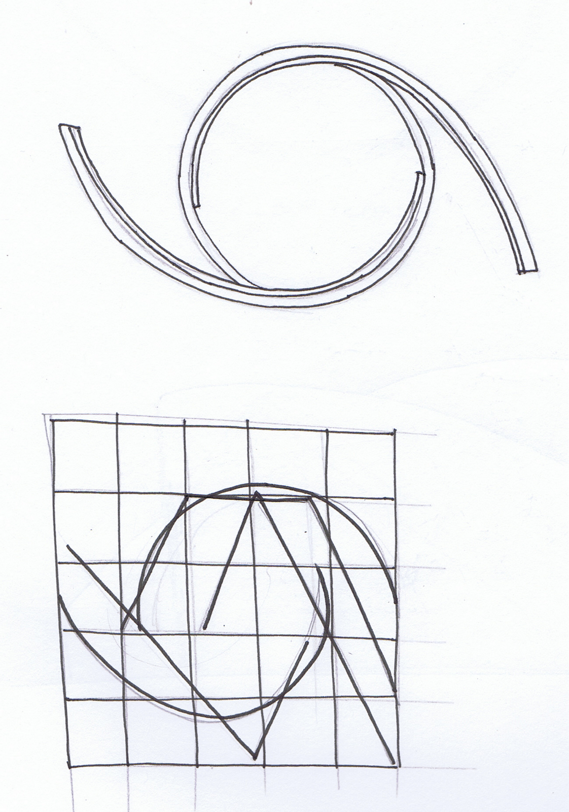
I went away and looked at the site by myself. After tracing over the lines of the city, I noticed that there was a distinct juxtaposition between the grids of the streets and the bold curves that occasionally appeared, and thought that this might be an interesting abstraction to use in our design.

In regards to the subject that I wanted to teach about, my first instinct was to investigate the history of the wharves. From the Brisbane City Council website history, I found out that the building of the wharves had created a huge number of jobs for the people of the city, but that they had ceased work due to the commencement of World War II. Air shelters were built on the site, and I thought it might be interesting to consider building a folie that tried to recreate some of the spatial feelings of hiding in the air raid shelters during war time. I was inspired partly by the way that the Jewish Memorial in Berlin aims to give users an awareness of the suffering of the Jews during the war through a spatial experience, and thought that could be useful and unusual on the site. After looking at the proposed plans for the site, however, I saw that it was already planned that the shelters would be restored and a thorough history of the site given.

My mind began to turn instead back to the river, and the impact that it had had on the city. It was a force that both gave and took away from the inhabitants of the city, and I thought that through our previous idea of movement within the folie, we could come up with a very interesting concept that way. The river had provided jobs for the inhabitants when the wharves were built, but had also taken away from them during the two major floods of the city in 1974 and 2011. My initial design that I took to the next group meeting used the curves and grids that I had taken from the aerial view of the city, and created a folie whose walls moved during the different tides of the river to create different spaces at different times of day.

Wednesday 14 March 2012

Week 1: Walkshop

This week we needed to complete the DAB525 Walkshop and at the end visit the Howard Smith Wharves site. The walk was meant to be completed on Monday 5th, but as it was raining the walk was called off, and I did it instead on Wednesday 7th. While all of the walk was significant to an understanding of Brisbane as a whole, there were certain parts that I felt were particularly relevant to the Howard Smith Wharves site and the design of our folie. My walk started from the turn around point outside of the university, and continued left down Alice street and then right down William street and into the courtyard outside the Registry of Births and Deaths. It was at this point that I started to notice the use of different flooring, as well as small physical barriers, to demarcate areas with different intended uses.


Caption: The paving changes from one style to another to indicate that the pathway is leading to a space that is different in use to that of the footpath.  The metal bar prevents drivers from mistaking it as a driveway.


In the courtyard itself there is another changing in flooring that this time acts as a memorial to Brisbane's architectural history.


Caption: The footings of a house built in the 19th century are marked out with paving in the middle of the courtyard.


Caption: The paving from the footings meeting with the general paving of the courtyard create interesting shapes that could be used as inspiration for the form of the folie.


This paving has created two ideas for the design of our folie: one is the idea of creating a folie that is a subtle memorial to an aspect of the sites history; the second comes from the shapes that are created when the paving of the footings meets with the paving of the rest of the courtyard. There are some interesting shapes created here, and I find the idea of using shapes made by the crossing of different lines or axes around the site as inspiration for the shape of the folie interesting, as not only would it give us a starting point, it would also hopefully make the design more readable to the users.


I walked through the courtyard onto George street, and continued along there until I reached Queens Park. Here I noticed a strong division between walking and pausing space, but it was particularly the crossing of different pathways of movement that I found interesting in relation to my previous idea of using different axes to create shapes.


Caption: Queens Park is divided into different zones of movement and pause by pathways designed to get users from one node of activity to another in the fastest way possible.


I moved on from there down Elizabeth street, through St Stephen's Cathedral Precinct and along onto Eagle St Pier. It was possible to see the site from here, and and it was interesting to see the scale of the buildings already on site compared to the scale of the Story Bridge. I also thought that the pictures from this point might be suitable for a photo montage as most of the site is visible, and would therefore put the folie in its full context.


Almost the entire site can be seen from this point. 


I thought that the shape of the bridge, with its straight lines of bracing, actually created a couple of curved, strangely soft shapes in the negative space above it.


I also thought that it was interesting to not how much the solid, bold footings of the bridge and the box shapes of the sheds there stood out from the relatively busy background of trees and cliff face.


Caption: The footings of the bridge and the sheds against the busy background of the natural environment.


Although these elements are much larger than the space that we have to design our folie in, I think it might be useful to consider using some bold elements in our folie design to allow it to stand out from the background, and possibly make it compete more with the scale of the bridge.


As I continued along the walk I noticed the presence of different paving to designate areas of varying uses which created unusual shapes. These instances occurred in multiple places along the riverside walk, right up until I reached the site.


Caption: Unusual shapes created by the meeting of different paving. In many places there is an interesting combination of a grid of paving meeting a curve.


Looking at the site from the end of the riverside walk, I think that the space in between the two buildings under the bridge and the one further along the river might be a good place to put the folie. It would be separated from the other structures and would instead be amongst greener, allowing it to stand out as a built structure in itself, rather than as just an extension of the existing structures. It would also separate it from the enormous scale of the bridge footings.


The site seen from the end of the riverside walk. There is a space in between the two lots of buildings that may provide an interesting space to create a folie that can stand on its own as a structure of importance. 
Looking at the site through the fence that surrounds it, it is possible to see the interesting juxtaposition of the jagged, uneven surface of the cliff and its textured greenery with the bold, heavy lines of the bridge above it. Both of these types of form (jagged and uneven or bold and heavy) may be interesting concepts to explore in the design of the folie, as the use of either might perhaps make the folie more readable to the users of the space.


The juxtaposition of different types of forms in the artificial bridge and the natural cliff face. 


The other end of the site which is dominated by the natural cliff face rather than the bridge. It could be interesting to introduce a bold form into the section of the site to create a heterogeneous textural space. 

Tuesday 13 March 2012

Reading 1: Paris/La Villette

For the first design project of this semester, we have been given the task of designing a folie to sit on the Howard Smith Wharves, a site that is currently unoccupied and inaccessible but which was previously intended to be redeveloped into a parkland. I had previously only known of a folie as a small building in the land of wealthy families; as far as I'm aware, they weren't generally used as more than decoration. In order to learn more about what a folie can be in another situation, I read G. Bure's Paris/La Villette (2008), and was really interested in a lot of the ideas and concepts that Tschumi used when designing his folies.

The history of the site greatly informed his design choices (p.47); as the site was neglected, it was perceived by many as a space of little importance, a "perfect void" (p.48). In order to counteract this, Tschumi's installations revolved around the concept of "space, event and movement" that would help to activate the site. I think that this concept is an important one, especially in the site that we have been give, which at the moment, due to the cliff face and lack of connection between the riverside walk and the site, is on a separate plane to that on which people exist day to day. I feel that a passive structure would do little to reenergise the site and bring people to it, whereas a structure that embodies "space, event and movement" could be used to get peoples' attention at a distance and draw them to the site.

I was also particularly interested in the reasons for Tschumi's selection as the competition winner. His design was selected because of its "readability, rigor and simplicity of expression, combined with complexity of reasoning and multiple possibilities" (p.54). I think that it would be interesting and useful to the project to try and create "multiple possibilities", which Tschumi created through a series of structures, in our one structure, as I believe that this could do a lot to activate the space and create an unusual but effective learning environment. The concept of readability in a design is also important in this situation. I'm interested in abstraction the shapes that can be found in the surrounding areas, as well as drawing on the materials used both currently and historically to create a structure that can be understood by the user and that fits in the site.